Whether I’m sewing, crocheting, card making, painting, or doodling, I’m always making something here in Kamloops, B.C. Don’t forget to check out my free digitals and vintage graphics while you’re here. Enjoy your visit!
Showing posts with label Masculine. Show all posts

May 2, 2025

Catching up With Cards

Hello!

The winter is finally gone and the bees are out. Here in the ‘Loops the sun is shining and the Lilacs are in full bloom. They smell wonderful out there! 

Anyway, on to some cards I’ve made recently…


These guitar cards’ strings are too fat, but I found some thinner ones that will work better for the next one. 


Note the embossing on the envelopes


This was my attempt at tone on tone. I almost did it but couldn’t resist adding the black. 


I made the watercolor backgrounds on these two cards then used diecuts on them.


Another attempt with tone on tone - - I still don’t have it quite right, but simple is hard! 


This card was an attempt to use up leftovers for the background and then add stickers and embellishments. These look great with flowers, but I don’t have a lot of realistic looking flowers so I used stickers. The butterfly and sentiment are popped up. 


Next I made these. I wanted to use flowers on a masculine card but with an industrial or steampunk feel. The diecuts worked well through the tape, which was surprising to me. I like how these turned out with the brads that look like screws. I also did up a small tag.


Unfortunately I took these pictures at night, but you get the idea.
 I love the flowers on there and think it works. Next I’ll try them with a steampunk card.

I hope all is well with everyone. Thank you for stopping by to take a peek. 

Blessings,
Carmen


Sep 1, 2024

Birdy Anniversary, AI

Good morning,

Just a couple of quick shares. These first two are similar. I love the saying because it’s fairly versatile and will work for different types of cards.


This last one is a nice masculine card for almost any reason. Just because, graduation, birthdays, Father’s Day…


I think the biggest struggle with the AI images is that most of them are square, but cards are usually rectangular. I kind of struggled with this card because of that, but it’s ok.


So that’s it for today. When I print these off I use standard paper on high quality, but I put cardstock in the printer. That seems to work best for me. If I use glossy or photo paper, the print doesn’t show up as well. Idk if that’s just my printer, but that’s what I have to do to get a good quality printout. 

Thanks for stopping by,

Carmen

Apr 23, 2024

Antique Rust

Hello there, 

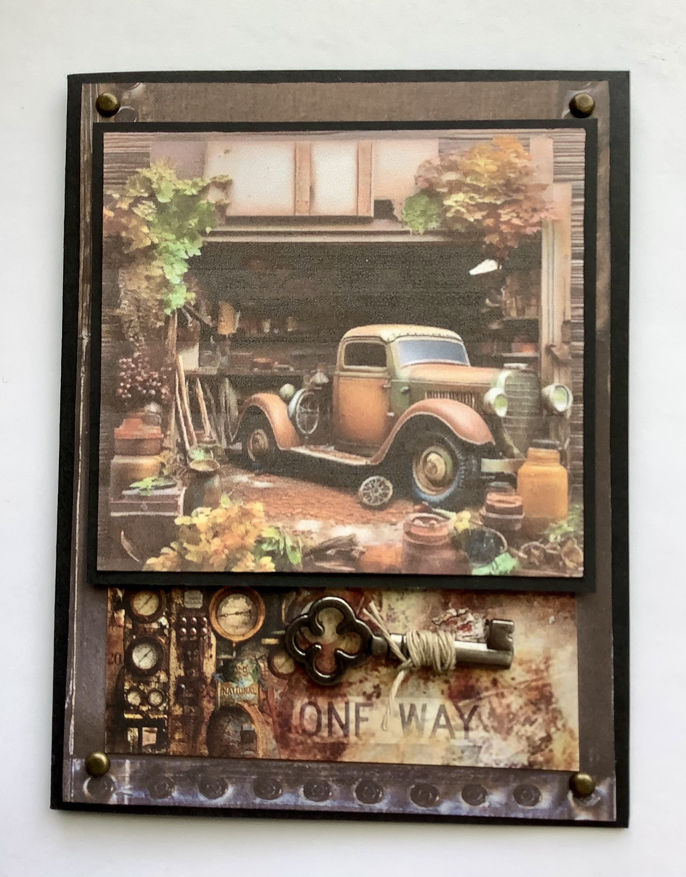
Today I thought I’d share a little bit of my card making process. The images I’m using came from Playground, an online image generator. First I will share the completed cards. 


First I ran them off on the printer and cut them to size.

Next I backed them with black cardstock that was about a 1/4” larger around the perimeter of the image. (See below)

Then I picked out some papers that complimented the images. 


As you can see, I used studded metal-look paper I had in my stash. (You can see the main images backed with cardstock). I always look for paper elements I can use on the card front. In this case, the clock, some brick paper, license numbers, rusty panels, tags, etc. Some of the paper is Ciao Bella’s Collateral Rust. I wish I could get more of it in Canada at a reasonable price! 

Once I’ve figured out which of those I want to use and where, then I look for other elements I can add to bring interest. These are some of the items I pulled out. 


I have metal brads, cork ribbon, jute cord, loosely woven canvas, metal keys and fans, etc. In this case I added brads to each card, keys to two cards, a spinner to two cards and some jute to a tag and the keys, and some cork ribbon.

Once I’ve decided what to use, I start to add adhesive to each section. In the example below, I have the background of the card front with brads added to each corner, and a paper element adhered in place. On the paper element is a key which I’ve wrapped in jute and adhered in place with red embellishment tape. To the left is the back of the main image with foam tape added to bring some height. 


Here is the finished card top with the raised image in place. 


Now that the front is done, we can adhere the already prepped card front onto the card base. 


But I’m not done yet. Next comes the inside. This needs to be plain enough that you can write on it. I tend to use a piece of designer paper that either matches or compliments the background of the front of the card. Then I add plain cardstock on top. Sometimes I further embellish with paper elements on the left side of the open card. 

I often sign the back of the card with my initials. Now I’m done. 

I hope that was easy to understand. One of the pictures was a bit fuzzy so I went ahead without it. If you have any questions, please ask below. The finished card was 4 1/4” x 5 1/2”.

Thanks for stopping by. 

Blessings,
Carmen

Sep 4, 2021

Ciao Bella, Collateral Rust

Hello,

I spent a bit of time playing with a new Ciao Bella pad called Collateral Rust. I have to say I love this pad. There are so many options of what you can do. I decided to make more guy cards as I need a few more that are ready to send or sell. 

I did up four for now.


I added a hemp wrapped key and some screw brads onto this one. The inside has matching papers but is left blank so you can use it for any occasion. 


This one for a bike enthusiast also has screw brads added. The main picture is raised with foam tape. Inside is papered but blank.


This is my favorite. I’ve added brown ink for a more rusty feel and a metal wrench. The main picture has been popped up with foam tape. The inside is papered with no sentiment. 


Last but not least, another Route 66 card with a truck. The main picture has been popped up with foam tape. I added the word RUST and some metal brads in the corners. 


If you’re local, I sell these for $7 each or two for $12. These are not prints, but the original card with envelope. 

Thanks for your visit!

Blessings, 
Carmen

BRUTALLY HONEST SLOGANS 🤪


Aug 22, 2021

Stamperia Cosmos Cards (5)

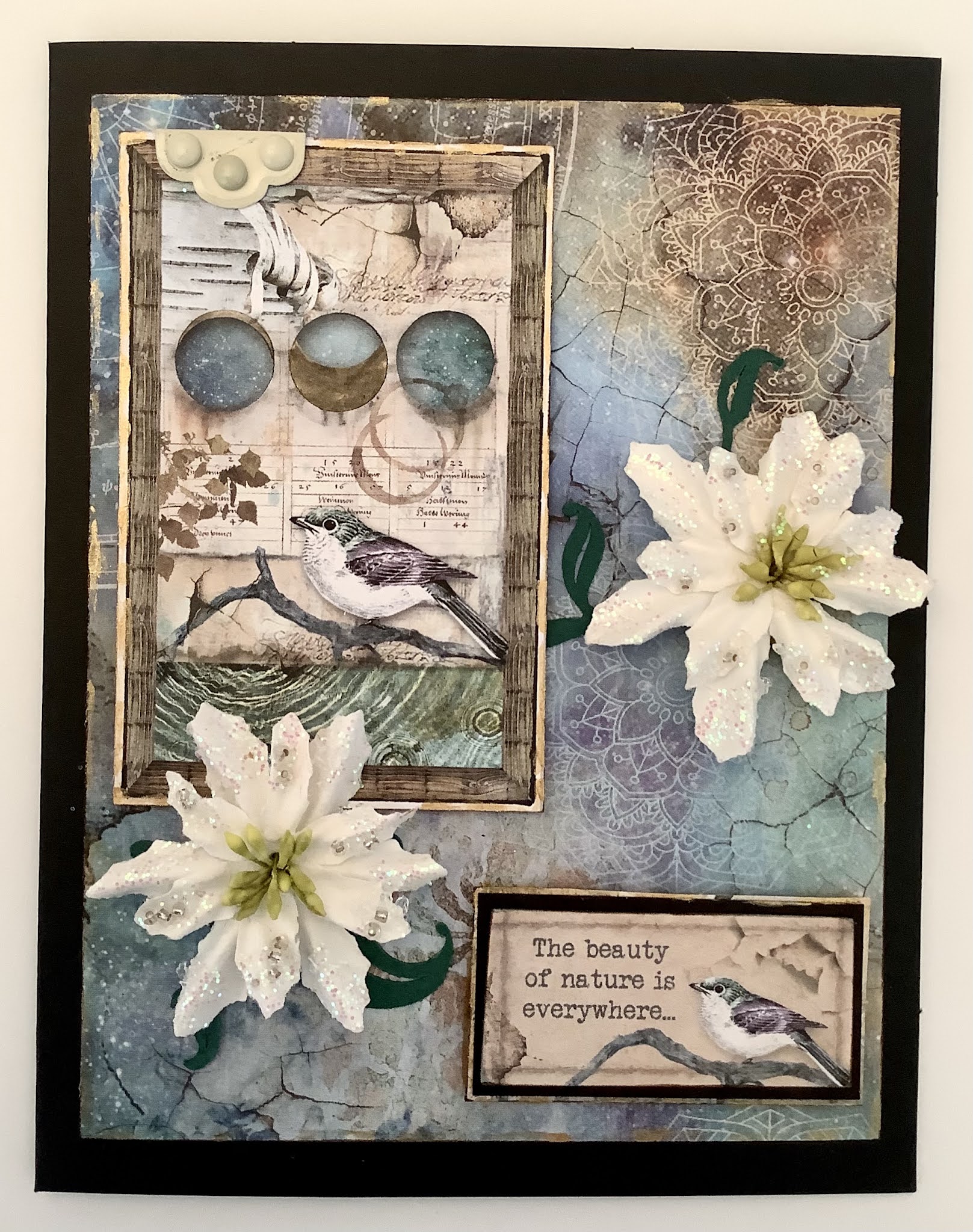
I hope you liked my Little Book of Hope ! As promised, here are a few cards I made with the rest of the 8X 8 Stamperia Cosmos pad. I still have lots of papers left, some of which will be used for the inside of the cards. 

(1)


I inked the edges of all five cards with Distress ink and then painted the edges haphazardly with a bit of gold acrylic paint to start. 

To this card I added a metallic star clip, some hemp cord and a couple of old flowers from my stash, fastened with a brass colored brad.

I also added brads to the corners of the bottom paper.

The top two papers were attached using dbl sided tape.

 I intentionally used masculine elements on most, but this card could be gifted to both men or women. 

(2)


Here again you see bits of the gold acrylic paint on the edges of the card. 

I started by adhering the top two layers with dbl sided tape and then used the foam tape underneath for dimension. 

Colored hemp cord was wrapped around it with a bow. 

You’ll note that I curled over the top corner of the third layer and attached it with a metal brad. I adhered some little sprigs meant for inside flowers underneath to add some interest. 

I adhered it all to the fourth layer.

The butterfly is one of my signature embellishments. In fact, a friend has butterflies pop up on her screen whenever I message her. Lol. 

I had some loosely weaved blue “ribbon” given to me a while back. I took small amounts of that and placed it below the bottom layer here and there. You can just barely see it in the top photo. 

(3)


Again, inking and gold paint on the edges. 

Having just bought some leaf rub-ons, I decided to add them to the bottom layer of this card.

I v-cut and roughed up a couple of spots on the edge of this layer also. Using a poker I made some holes and weaved hemp cord through them for a decorative element. Behind the openings I taped some darker papers with embellishment tape. This helps keep the cord in place as well. 

Using dbl sided tape I adhered the top two layers together after roughing up the black card stock a bit. I like that look on men’s cards. 

Finally I added more gold paint to the top layer and to the leaves to complete this card. 

(4)


I inked and painted the edges. On the bottom layer I rubbed on some distressed edges I have in my stash, then put it aside for a bit.

I cut a moon from another paper in the pad, inked it, attached foam and put it aside. 

The next two layers were adhered together with dbl sided tape, and then it was all attached in place. 

I wasn’t quite happy with it so added the metal corners with embellishment tape, and then added the adhesive tan colored pearls which had been in my stash forever! Then it was done. 

(5)


Lastly, and probably the quickest of the lot was this card. 

The sentiment was included in the pad, so I cut it out, and backed it with black card stock. They were inked and painted with the gold. 

The main panel was backed with some paper out of the pad, and also inked and painted. On the top left I added a little hinge embellishment. I believe it’s Close to my Heart. 

I had a large vine which I placed first, then added the main panel with foam tape. I placed the sentiment with foam tape also

Then, two flowers I had in my stash and it was complete.

This one is more feminine, I would say.

*********

That’s all five of my cards from the Stamperia Cosmos paper pad, plus a booklet, and there’s papers left. Quite a few, actually. 

The nice thing about this paper pad is that if you’re stretched for time, you can make a very quick card that looks impressive without the additional embellishments and techniques. 

I’ve bought a few paper pads recently from Stamperia and Ciao Bella. I think there will be more cards in my near future! 

Thanks for stopping by and please say hello below if you have the time!

Blessings, 
Carmen

BRUTALLY HONEST SLOGANS


Apr 8, 2021

Metal Born to Ride Card

Hello! 

After driving through rain, sleet and snow, we’ve been granted a sunny day today here in the Loops! I love playing around in my studio when the sun is shining so that’s where I spent some time today. I have a friend who is turning 60 soon. I took an old method and applied it to this card. I love making masculine cards.


To make this I grabbed some electricians tape, mixed media tools, regular necessities like double sided tape and some fun things like rub-ons, brads and Stickers. Then I remembered he loves to ride and is an avid musician - - and out popped a card! Like magic! 


Above is a photo of the taped piece so you can see what I did with it. It’s hard to get it to show up because it’s so shiny and reflective. I had some...oh man, I forget what they call it, but it gives you the waffle pattern underneath the tape. It has a sticky side so I just stuck it in place and put the tape over top of it. Then I grabbed my little tools and ran them over the seams, and since this was a motorbike card, I had random “tire prints” all over. I used the poky tool to make dots that look like rivets.

I used a retired stamp set from Stampin Up called Born to Ride that I got at a garage sale. 

A couple more photos. 


If you’d like to see some of my other “metal” works, here are a few links: 


If you’d like to see other motorcycle cards:

All Free Digitals (scroll down)


Thanks for stopping in. Hope you enjoyed it!

Have a great weekend!
Carmen

Jun 14, 2020

Masculine Card Fun!

It's June, which means lots and lots of rain. More than usual, in fact. So I am happily in my studio playing with all my crafty stuff. As you know, Father's Day is just around the corner and I've been making some cards. I love making masculine cards and I seem to have lots of masculine papers lying around. I've been wanting to use these particular papers for a long time, but have found them hard to work with. When you're unsure what to do, sometimes you just have to have that attitude. You know, the one that says....I'm not sure what I'm doing, but I'm doing it anyway. That was what happened here. 

Honestly, the lighting is such a problem. I take them on my iphone or ipad and transfer them to my laptop. They look great on the ipad....but alas....pink.


A peek on the inside of this one.


This is the second one.


And a little peek inside this one.


I wrote out DAD on the fountain pen nibs, and note the ink splotches which I drew in. Both cards have raised images on the front to give it some interest. I also rubbed on some edges and glued on corners and 3D clear dots.

Hope things are drier and sunnier where you are! 

Blessings,
Carmen